小程序开发 自定义组件
创建自定义组件
微信小程序文档中提供的组件有限,一定程度上限制了开发需求,这里就需要我们自定义一些控件,实现开发需求。
自定义控件有两种方式,一种是选择模板的方式,另一种是选择组件的方式来创建。这里我选择了组件方式来创建,这样只需引入组件和外部添加数据,内部展示数据,即可实现重用。
如下所示,这里有一个专门的组件页面
类似于页面,一个自定义组件由 json wxml wxss js 4个文件组成。要编写一个自定义组件,首先需要在 json 文件中进行自定义组件声明(将 component 字段设为 true 可将这一组文件设为自定义组件):
{
  "component": true
}
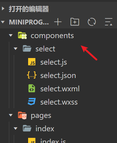
文件目录结构
这里一定要注意目录结构,一般把项目中的业务文件放在 pages 中,图片放在与 pages 同级的 images 文件中,第三方的 sdk 存放在 libs 文件中,工具类存放在 utils 文件中,同样把共用的自定义组件存放在同级的 components 文件中。这样便于管理,查找使用。
自定义组件
这里选择组件的方式来自定义创建一个 select 组件。
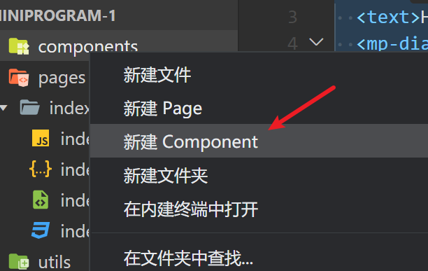
在 components 文件目录下,创建一个 select 文件夹,随后 select 文件夹下手动创建:select.js、select.json、select.wxml、select.wxss 四个文件。
注意: 可以在 select 文件夹下自动创建上面四个文件,自动创建的文件会自动配置好代码。只需在引入组件的时候,在引入组件的页面的 json 文件中配置组件的名称和组件的位置即可。
配置 json 文件
具体参考自 官方文档 微信小程序 Component 构造器
在 json 文件中写入代码:"component": true 表示自定义组件声明,代码如下所示。
{
  "component": true,
  "usingComponents": {}
}
配置 js 文件
同时,js文件中也需要写成这种格式,其代码如下:
// components/select/select.js
Component({
  /**
 1. 组件的属性列表
   */
  properties: {
    selectArray: {
      type: Array,
    },
    // 初始时要展示的内容
    currentText: {
      type: String,
    }
  },

  /**
 2. 组件的初始数据
   */
  data: {
    isShow: false, // 初始option不显示
    arrowAnimation: {} // 箭头的动画
  },

  /**
 3. 组件的方法列表
   */
  methods: {
    //option的显示与否
    selectToggleAction: function () {
      // 获取当前option显示的状态
      var nowShow = this.data.isShow;
      // 创建动画
      var animation = wx.createAnimation({
        timingFunction: "ease"
      })
      this.animation = animation;
      if (nowShow) {
        animation.rotate(0).step();
        this.setData({
          arrowAnimation: animation.export()
        })
      } else {
        animation.rotate(180).step();
        this.setData({
          arrowAnimation: animation.export()
        })
      }
      this.setData({
        isShow: !nowShow
      })
    },
    //设置内容
    selectItemAction: function (e) {
      // 当前option的数据是引入组件的页面传过来的,所以这里获取数据只有通过this.properties
      var nowData = this.properties.selectArray;
      var index = e.target.dataset.index; // 当前点击的索引
      var current_text = nowData[index].name; // 当前点击的内容
      var current_type = nowData[index].type; // 当前点击的内容
      // 再次执行动画,注意这里一定是 this.animation 来使用动画!!!!!!
      this.animation.rotate(0).step();
      this.setData({
        isShow: false,
        current_text: current_text,
        arrowAnimation: this.animation.export()
      })
      // 内容更新后,需要把更新的数据传输出去
      var nowDate = {
        id: index,
        name: current_text,
        type: current_type
      }
      // 这里的 getNowData 要和外部的 bind:getNowData ,名称一定要对应
      this.triggerEvent('getNowData', nowDate);
      console.log("选择之后的current_text", current_text);
    }
  }
})
1、Component 构造器可用于定义组件,调用 Component 构造器时可以指定组件的属性、数据、方法等。
2、properties 是组件的对外属性,是属性名到属性设置的映射表,属性设置中可包含三个字段, type 表示属性类型、 value 表示属性初始值、 observer 表示属性值被更改时的响应函数。
3、data 和普通页面的 data 一样,是组件的内部数据,和 properties 一同用于组件的模版渲染。
4、methods 组件的方法,包括事件响应函数和任意的自定义方法,关于事件响应函数的使用。在这里面获取数据有两种方法:一种是获取 data 里的数据: this.data.属性名;一种是获取 properties 中的属性值: this.properties.属性名。
配置 wxml 文件
在 wxml 文件中,代码如下所示:
<view class='section-select-box'>
  <view class='select-content' bindtap='selectToggleAction'>
    <view class='select-text'>{{currentText}}</view>
    <image class='select-img' src='../../images/icon_arrow_down.png' animation="{{arrowAnimation}}"></image>
  </view>

  <view class='select-list' wx:if="{{isShow}}">
      <view class='select-list-item' wx:for="{{selectArray}}" data-index="{{index}}" wx:key='{{index}}' bindtap='selectItemAction'>{{item.name}}</view>
  </view>
</view>
1、animation 方法是为了获取当前点击元素的索引与内容。这里 animation="{{arrowAnimation}}" 是箭头转动的动画效果。
2、bindtap='selectToggleAction' selectToggleAction 方法是控制下拉选项框隐藏和显示的事件。
3、bindtap='selectItemAction' selectItemAction 是下拉选项框选择子项之后,设置内容的事件。
4、wx:if="{{isShow}}" isShow是为了控制 option 选项显示与隐藏。
编写 wxss 文件
在 wxss 文件中,代码如下所示:
.section-select-box {
  margin: 20rpx 30rpx;
  width: 690rpx;
}

.select-content {
  border: 2rpx solid #e2e2e2;
  border-radius: 10rpx;
  background: white;
  font-size: 34rpx;
  position: relative;
  height: 80rpx;
  line-height: 80rpx;
  padding: 0 10px;
}

.select-text {
  overflow: hidden;
  text-overflow: ellipsis;
  white-space: nowrap;
  font-size: 32rpx;
}

.select-img {
  position: absolute;
  right: 30rpx;
  top: 10rpx;
  width: 60rpx;
  height: 60rpx;
  transition: all .3s ease;
}

.select-list {
  background: white;
  width: inherit;
  position: absolute;
  border: 2rpx solid #e2e2e2;
  border-top: none;
  box-sizing: border-box;
  z-index: 3;
  max-height: 160rpx;
  overflow: auto;
}

.select-list-item {
  height: 30px;
  line-height: 30px;
  border-top: 2rpx solid #e2e2e2;
  padding: 0 10px;
  text-align: left;
  overflow: hidden;
  text-overflow: ellipsis;
  white-space: nowrap;
  font-size: 14px;
}

.select-list-item:first-child{
  border-top: none;
}
使用组件
使用自定义组件前,需要在引入组件的页面的 json 文件中配置,比如我要在 index.wxml 中引入,那么在 index.json 中我就需要配置:
{
  "usingComponents": {
    "Select": "/component/select/select"
  }
}
配置好后,在 wxml 引入组件,代码如下:
<Select class="section-select" select-array='{{selectArray}}' current-text="{{current_text}}" bind:getNowData='getCurrentTextAction'></Select>
1、select-array 是在组件中自定义的属性名,这个是和组件所在的 js 中 properties 中的属性是对应的。
在 properties 定义的属性中,属性名采用驼峰写法例如:selectArray。在引入组件的 wxml 中,指定属性值时则对应使用连字符写法例如:select-array='{{selectArray}},selectArray 为 select 组件中所需展示的数据源。
2、这里 getNowData 是自定义的子组件需要触发的事件名,getNowData 是引入组件的页面需要获取传过来的数据的自定义的事件名。
// 内容更新后,需要把更新的数据传输出去
var nowDate = {
  id: index,
  name: current_text,
  type: current_type
}

// 这里的 getNowData 要和外部的 bind:getNowData ,名称一定要对应
this.triggerEvent('getNowData', nowDate);
console.log("选择之后的current_text", current_text);
在引入组件的页面的 js 添加引入组件时,自定义的函数:
getCurrentTextAction:function(e){
  let item = e.detail;
  this.setData({
    current_text: item.name,
    current_type: item.type
  });
}
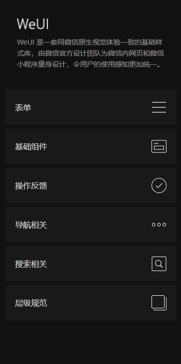
使用 WebUI
参考资料 官方文档 WeUI
如果页面的所有样式都自己写,还是挺麻烦的,也没有这个必要。腾讯封装了一套 UI 框架 WeUI,可以拿来用。
手机访问这个 weui.io 可以看到这套 UI 框架的效果。
引入依赖
有两种引入方式,第一种是使用微信自带的 useExtendedLib 扩展库,使用这种方式引入相当于引入了对应扩展库相关的最新版本的 npm 包,同时也不占用小程序的包体积。
第二种则是使用 npm 的方式导入包
useExtendedLib 的方式引入依赖
指定需要引用的扩展库。目前支持以下项目:
首先在 app.json 文件中加入 useExtendedLib 字段
{
  "useExtendedLib": {
    "kbone": true,
    "weui": true
  }
}
在页面的 json 文件加入 usingComponents 配置字段,在哪个页面使用就在该页面的 json 文件里加这个组件的引用
{
  "usingComponents": {
    "mp-dialog": "weui-miniprogram/dialog/dialog"
  }
}
然后就可以直接使用这个组件了
<!--index.wxml-->
<view>
  <text>Hello world</text>
  <mp-dialog title="test" show="{{true}}" bindbuttontap="tapDialogButton" buttons="{{[{text: '取消'}, {text: '确认'}]}}">
    <view>test content</view>
  </mp-dialog>
</view>
可以看到效果如下:
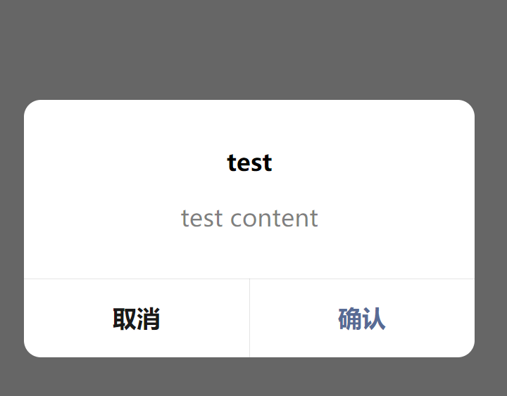
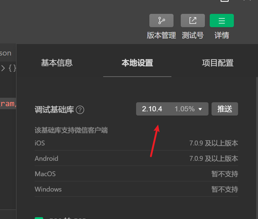
注意!!!要把基础库版本设置为 2.2.3 及以上版本